Why cross-browser compatibility is crucial in web design
Your visitors use Chrome, Safari, Edge, Firefox and phones of every size. Here’s why your website has to work on all of them, and how we make sure it does.
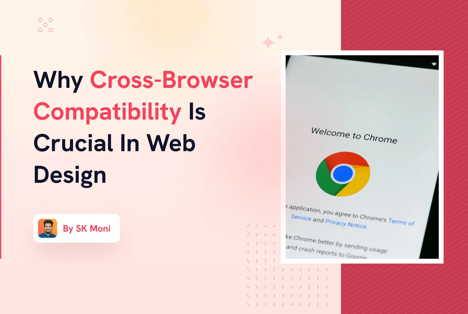
Cross-browser compatibility means your website looks and works the same way in every browser and on every device your visitors use: Chrome, Safari, Edge and Firefox, on desktops, tablets and phones.
Imagine launching a new website, then finding out it looks broken on a client’s iPhone. That’s what cross-browser testing prevents.
Why it matters
- You reach everyone. Your visitors don’t all use the browser you use. A site that only works well in one leaves people out.
- A smooth experience. Buttons that don’t respond or layouts that overlap make people leave, and they rarely come back.
- Search visibility. Google looks at how a page works for real visitors, especially on phones. Broken layouts and slow pages hurt rankings.
- Trust. A site that looks right everywhere feels professional. One that breaks feels neglected.
Why it’s tricky
- Browsers read code differently. Small differences in how each browser handles layout, fonts and forms add up.
- Browsers update constantly. Something that worked last month can change after an update.
- Phones behave differently. Mobile Safari and Chrome on Android each have their own quirks, and screen sizes vary widely.
How we make sure a site works everywhere
- Responsive design from the start. Every layout is designed for phones, tablets and desktops, not squeezed afterwards.
- Testing on real browsers and devices before launch, not just the one on the designer’s screen.
- Clean, standard code. HTML, CSS and JavaScript that follow web standards break far less often.
- Progressive enhancement. The core of the page works everywhere; extra effects are added only where the browser supports them.
The short answer
Cross-browser compatibility isn’t a box to tick at the end of a project. It’s part of designing a website for real people on real devices. Get it right, and every visitor sees the site you paid for. After launch, regular maintenance keeps it that way as browsers update.
See how we approach custom website design, from Figma layouts for desktop and mobile to the finished build.